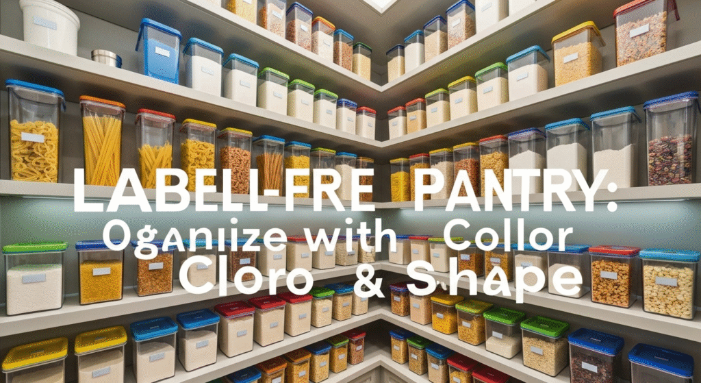
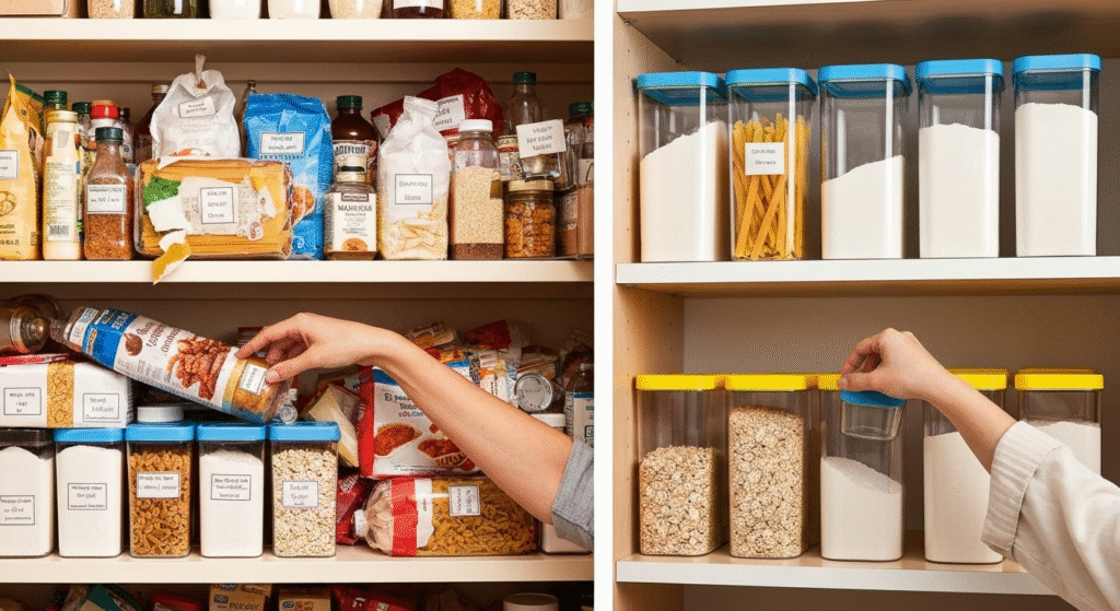
A well-organized pantry is the heart of an efficient kitchen. For years, the go-to solution has been the label maker, plastering every jar and bin with neat, descriptive text. But what if I told you there’s a more intuitive, faster, and visually appealing way to organize? A label-free pantry identification system using color and shape leverages the way our brains are naturally wired, transforming your food storage from a library you have to read into a visual map you can understand at a glance.
Over my years helping people reclaim their kitchen spaces, I’ve seen the simple label system fail time and again. Labels get smudged, they’re hard to read in dim light, and they don’t help young kids or non-readers find what they need. That’s why I began exploring and implementing visual organization methods. This isn’t just about making the pantry look pretty; it’s about creating a system that works with your brain, not against it, making your daily routine smoother and less stressful.
My name is Edom Clark, and I’ve spent years exploring and writing about the art and science of kitchen storage. My passion isn’t just about tidy shelves; it’s about understanding how we interact with our spaces and creating systems that are both functional and feel good to use. I believe a great pantry system shouldn’t require a manual. Through my work with countless clients, from busy families to individuals seeking a more calming home environment, I’ve honed these visual strategies to be practical, adaptable, and truly life-changing. My goal is to share what I’ve learned, moving beyond generic tips to offer clear, research-backed explanations that you can apply in your own home.
Why a Label-Free System Works Better
Before we dive into the “how,” let’s break down the “why.” Traditional labels rely on language processing, which is a multi-step process for our brains. You have to locate the label, focus on it, read the word, and then process its meaning. A visual system based on color and shape taps into something far more primal and immediate: preattentive processing.
The Limits of Text in a Fast-Paced Kitchen
Think about your morning rush. You’re trying to make breakfast, pack lunches, and get out the door. The last thing you want to do is squint at small text to tell the difference between all-purpose flour and bread flour.
Here’s where labels often fall short:
- Cognitive Load: Every label you read adds a tiny bit of mental work to your day. It’s like reading a list of street signs instead of just following a brightly colored map.
- Accessibility Issues: For children who can’t read yet, or for adults with dyslexia or vision impairments, a text-based system can be a genuine barrier. I once worked with a client who found his pantry incredibly stressful due to dyslexia. Switching to a color-coded system was a revelation for him; he could finally navigate his kitchen with confidence.
- Lack of Immediacy: You can’t assess your inventory at a glance. You have to read each label to know what you have, making grocery list creation a tedious chore.
The Power of Visual Cues: Color and Shape
Our brains are hardwired to recognize patterns, colors, and shapes in milliseconds, long before we’ve had a chance to consciously read a word. This is an ancient survival skill. We didn’t survive by reading “saber-toothed tiger”; we survived by instantly recognizing its shape and color.
A label-free system uses these “preattentive attributes” to create mental shortcuts.
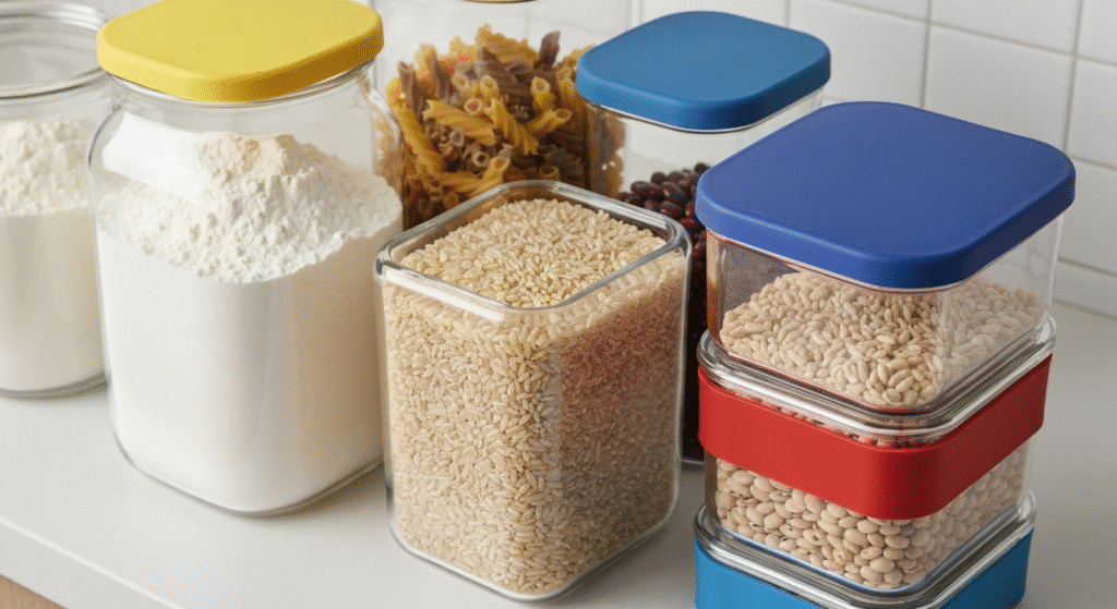
- Color: The most powerful visual cue. It can evoke emotions and create strong associations. Think of a traffic light: you don’t read “stop,” you just see red. We can apply the same logic to the pantry.
- Shape: The geometry of your containers can signal their contents. A tall, slender container is perfect for spaghetti, while a short, stout jar is ideal for sugar. Your hands learn the shape just as your eyes learn the color.
This combination creates a multi-sensory system that is faster, more inclusive, and reduces the daily friction of managing your kitchen.
The Science Behind a Visual Pantry
To build an effective system, it helps to understand a little about the psychology of how we see and interpret the world. It’s not just about picking random colors; it’s about creating a logical visual language for your kitchen.
How Color Psychology Can Organize Your Food
Colors aren’t just decorative; they carry meaning. By assigning colors to food categories, you create an intuitive filing system. The key is to be consistent and choose colors that make sense to you.
Here is a sample framework you can adapt. The “rationale” is the key to making the system stick.
| Food Category | Suggested Color | Rationale (Why it Works) |
| Grains & Pasta | Blue | A calm, stable color for staple, foundational foods. |
| Baking Supplies | Yellow or White | Reminiscent of flour, sugar, and butter—bright and clean. |
| Snacks & Cereals | Green | A vibrant, “go” color, perfect for quick-grab items. |
| Nuts, Seeds, Dried Fruit | Brown or Orange | Earthy tones that connect to the natural source of the food. |
| Beans & Legumes | Red | A strong, hearty color for protein-rich, substantial foods. |
| Spices | (Varies) | Often best left in original or uniform small jars, categorized by shape. |
A Quick Tip: I often advise clients to start with just three or four main colors for their biggest food categories. You can always add more later. The goal is to build a habit, not create a complex system that you’ll abandon in a week.
Using Container Shape as a Second Layer of Information
Shape is your system’s silent partner. While color tells you the category, shape can tell you the specific item. It also plays a massive role in the physical organization and efficiency of your space.
- Tall & Slender: Ideal for long items like spaghetti, lasagna noodles, or breadsticks.
- Short & Wide-Mouthed: Perfect for items you scoop, like flour, sugar, or oats. The wide opening is key for easy access.
- Square & Stackable: These are the workhorses of an efficient pantry. They eliminate wasted space between containers, unlike round ones. I use these for rice, quinoa, and lentils.
- Small & Uniform: Excellent for spices or small quantities of things like baking soda or cornstarch. Using uniform containers for spices makes them easy to line up and scan.
By combining color and shape, you create a powerful identification system. For example, in your pantry, “Blue + Square” might always mean rice, while “Blue + Tall” always means spaghetti. You’ll stop looking for the label and start reaching for the container instinctively.
A Step-by-Step Guide to Building Your Label-Free Pantry
Ready to make the switch? Here’s how to transition from a cluttered, text-heavy pantry to a streamlined visual one. This is a process I’ve refined over the years to minimize overwhelm and maximize success.
Step 1: The Great Pantry Reset
You cannot organize clutter. The first step is always to take everything out. Yes, everything.
- Empty the Shelves: Place every single item on your kitchen counter or dining table. This allows you to see exactly what you have.
- Clean the Space: With the shelves empty, give them a thorough cleaning. A fresh start feels motivating.
- Sort and Purge: Create three piles: Keep, Discard, and Donate. Check expiration dates. Be honest about that bag of specialty flour you bought two years ago and never used. Discard anything that’s expired or stale. Donate any unopened, in-date items you know you won’t use.
- Group the “Keepers”: Begin grouping the items you’re keeping into broad categories. Don’t overthink it. Just put like with like: all the pasta together, all the baking supplies together, all the snacks together. This will form the foundation of your new system.
Step 2: Choose Your Tools (Containers)
Your containers are the most important investment in this system. They provide the “shape” language and are the vehicle for your color-coding.
When I work with clients, we focus on function first, then aesthetics. A beautiful container that’s impractical is just more clutter.
Container Material Comparison
| Material | Pros | Cons | Best For |
| Glass | Non-porous (no stains/odors), long-lasting, looks beautiful, easy to see contents. | Heavy, breakable, can be more expensive. | Flour, sugar, coffee, anything you want to keep very fresh. |
| BPA-Free Plastic | Lightweight, durable, often stackable and space-efficient, less expensive. | Can stain (e.g., with tomato sauce), may absorb odors over time. | Cereals, snacks, pasta, kid-friendly items. |
| Ceramic | Blocks light (good for coffee, tea, some spices), stylish. | Opaque (you can’t see the contents), can be heavy and chip easily. | Items that need to be protected from light. |
My professional recommendation is to use a combination. Use clear, stackable plastic or glass containers for the bulk of your items so you can see the contents and quantity easily. This adds a third layer of visual information.
Step 3: Implement Your Color Code
This is where the system comes to life. You don’t necessarily need to buy a rainbow of expensive containers. There are several budget-friendly ways to add color.
- Colored Lids: Many container sets come with interchangeable colored lids. This is one of the cleanest and easiest methods.
- Chalkboard Paint or Washi Tape: You can paint the lids of your existing jars with different colored chalkboard paint. Colorful washi tape wrapped around the lid or the container body is another great, non-permanent option.
- Silicone Bands: Stretchy, colored silicone bands (like the ones used for cups) can be slipped over jars. They are removable, washable, and easy to change if you reorganize.
- Bin System: For items that don’t get decanted, like snack bags or cans, use colored bins. For example, all canned vegetables go in the green bin, and all canned soups go in the red bin.
When you decant your food into its new, color-coded home, do it systematically. As you pour in the flour, think “Yellow is for baking.” As you fill the pasta jar, think “Blue is for grains.” This active association will help you learn the system quickly.
Real-World Applications of a Visual Pantry System
The true test of any organization system is how it performs in daily life. Here are a few scenarios where this label-free method truly shines.
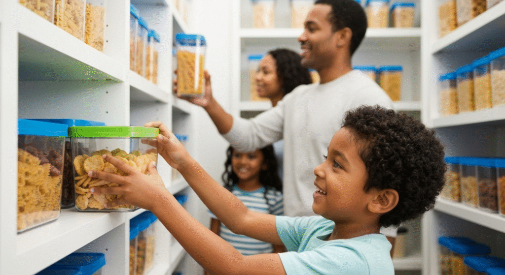
The Busy Family Kitchen
For a family with young children, the pantry can be a chaotic place. I designed a system for a client with three kids under ten. We used durable plastic containers with bright green lids for “anytime snacks” (like pretzels and apple chips) and placed them on a low, easily accessible shelf. Red-lidded containers on a higher shelf were for “ask-first treats.” The kids learned the system in a day. It empowered them to get their own snacks, reduced the constant “Mom, can I have…?” questions, and gave my client more peace of mind.
The Neurodivergent-Friendly Kitchen
For individuals with ADHD, autism, or other forms of neurodivergence, a cluttered environment with too much information can be overwhelming. A label-free pantry reduces visual noise and cognitive load. The clear, simple system of color and shape provides predictability and reduces decision fatigue. Instead of having to read 20 labels to find the oatmeal, the user simply has to look for the “blue-lidded tub.” It’s a calmer, more supportive approach to a daily task.
The Small Apartment Pantry
In a small space, efficiency is everything. This is where container shape is the hero. I once helped a client in a studio apartment with only two narrow pantry shelves. We replaced all his round containers and mismatched bags with uniform, square, stackable containers. We were able to fit nearly twice as much food in the same space because we eliminated the wasted air gaps between round jars. The visual clarity was a bonus, but the space-saving aspect was a complete game-changer for his tiny kitchen.
Frequently Asked Questions (FAQs)
Is a label-free system suitable for everyone?
It’s great for visual thinkers, families with kids, and anyone seeking a simpler, more intuitive system. However, if you have many very similar-looking items (e.g., ten types of gluten-free flour), you might benefit from a hybrid system: use color/shape for categories and small, discreet labels for specific items within that category.
How do you remember expiration dates without the original packaging?
This is a common and important question. My go-to method is to use a small dry-erase marker to write the date on the bottom of the glass or plastic container. It’s out of sight but easily checked. Alternatively, you can stick a small piece of painter’s tape on the bottom with the date written on it.
Won’t buying all new containers be expensive?
It can be, but it doesn’t have to be. Start with what you have. Thoroughly wash and reuse glass jars from pasta sauce or pickles. You can unify them by spray-painting the lids. Visit thrift stores for affordable glassware. The key is uniformity in shape and a consistent color-coding method, which you can achieve with tape or paint.
What’s the best way to start if I feel overwhelmed?
Start small! Don’t try to overhaul your entire pantry in one afternoon. Pick one category to start with, like your baking supplies or your snacks. Get the right containers for that section, implement your color code, and live with it for a week. The small win will motivate you to tackle the next section.
Conclusion: A Pantry That Thinks Like You Do
Moving to a label-free pantry organized by color and shape is about more than just aesthetics. It’s a fundamental shift in how you interact with your kitchen. You are creating a personalized, intuitive language that your brain understands instantly. This reduces daily friction, saves you time, and empowers everyone in your household—from the youngest child to the busiest adult—to use the kitchen with more ease and confidence. By taking the time to set up a system based on visual cues, you are investing in a calmer, more efficient, and more joyful cooking experience for years to come.

Hi, I’m Edom Clark, the creator and writer behind Taanzo. For the past five years, I’ve been exploring and writing about kitchen storage and home organization. My experience comes from both personal experimentation and hands-on observation — testing different storage systems, materials, and layouts to find what truly works in everyday homes. Over time, I’ve come to appreciate how small adjustments in storage can transform the way we cook, clean, and even enjoy time in the kitchen. Through Taanzo, I aim to share that knowledge in a way that’s honest, approachable, and genuinely useful.

